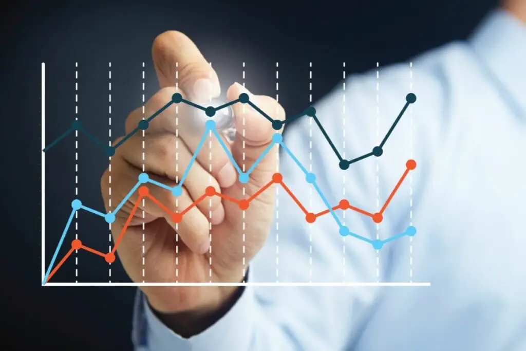
Data visualization has become an integral part of our lives. From Google Maps to Facebook feeds, data visualizations play an important role in our daily lives.
But what exactly is data visualization? And why should you care?

Data Visualization: What Is It?
Data visualization is the art of using numbers or other information to create images, graphs, maps, charts, diagrams, etc., to communicate complex ideas.
The goal is to present data in a way that makes it easier for people to understand.
Data visualization helps us gain insights into complex issues such as climate change, economic trends, and political events.
In addition, it allows us to better understand the world around us.
Why Is Data Visualization Important?
These visualizations are optimal ways of presenting data. A visual representation is often much easier to understand than a complex set of data.
As a result, it can improve understanding and knowledge of a subject area.
Visual representations also help us make decisions. For example, we use them when making buying choices, choosing which car to buy, deciding on a career path, choosing a college major, etc.
Furthermore, they allow us to share information with others easily. You can convey your point very effectively with data that has been visualized.
Plus, this information can be acquired at a quicker pace.
These visuals will highlight the key pieces of information in a digestible size. Most people will also find reading a chart or graph more engaging than simply reading numbers.
Data visualization is the process of representing data in a visual manner, which can be used to communicate information about that data.
It’s an important part of any data-driven business because it helps people understand and make sense of large amounts of numerical data.
As a result, these visualizations can improve business intelligence. They can help businesses to make more informed decisions.
Types Of Data Visualization

There are numerous ways of representing this information. This can include:
- Bar chart – Shows how many occurrences there were at each level of a variable.
As the name suggests, the information is presented in the form of bars. This is perhaps the most commonly used form of data visualization.
- Pie chart – Shows the percentage of occurrences of each category. Akin to a pie, this data is symbolized in a circle.
Larger figures of data take up a more substantial percentage of the pie chart.
- Bubble plot – Displays the relationship between two variables by showing their relative size and position.
Bubble plots are comparable to scatter plots but with a third variable.
- Line graph – Shows the trend of one variable over time. This is particularly useful in business settings.
- Scatter plot – Shows multiple relationships among different variables. These types of plots are commonly used in scientific studies.
- Choropleth map – Uses colors to represent categories of a variable. These are used to show data in a specific area or region.
- Histogram – Presents the distribution of data values along a horizontal axis. As a result, their function is similar to that of a line graph.
- Polar chart – Similar to a bar chart, but shows the frequency of occurrence of a variable. Data is visualized via a circle with various angles.
- Radar chart – Used to compare several variables simultaneously. They are quite complex charts and so may not be understood by everyone.
- Tableau – Allows users to visualize data interactively.
- Treemaps – A treemap is an interactive way to view hierarchical data. The user can zoom into individual nodes to see details.
- Network diagrams – Showing connections between objects. This type of diagram is often used to display social networks.
- Word clouds – Can depict the frequency with which words appear in a selected text. This can be used in literary settings and high schools. Plus, it can be used to see what words are associated with a brand.
- Box-and-whisker plot – Shows the central tendency (the median) and variability (quartiles). This is used to describe the central tendencies of a set of data.
- Flow chart – As the name suggests, it symbolizes the flow of a system.
These are perhaps the main types of data visualization, though others can also be used. Each type comes with its own advantages and disadvantages. Thus, they are suited to different scenarios.
Examples Of Data Visualization
You may be wondering “under what circumstances is data visualization used?” If so, here are some of the main settings that use this tactic:
- Business Intelligence (BI) – BI tools are used for analyzing and reporting on data. For example, you could use Excel to analyze your sales numbers.
You would then use pivot tables and graphs to report on them. Lien graphs are particularly useful for this, being able to depict business trends over time.
- Scientific research – Scientists use data visualization to help them understand trends within their data sets.
They might use bubble charts to look at the correlation between two factors.
- Education – Students use data visualization as a tool to learn about certain topics.
For example, students can create word clouds to find out how frequently certain words occur in a book.
- Marketing – Companies use data visualization to market products.
For instance, companies can use pie charts to demonstrate the popularity of different flavors of ice cream. These visualization tools can be used to make marketing decisions.
- Social Media – People use data visualization to share information with each other through social media sites like Facebook and Twitter.
- Politics – to represent information in different areas, choropleth maps are frequently used.
Namely, you may want to depict the popularity of certain parties in different areas.
Frequently Asked Questions
How Do I Choose The Right Data Visualization?
The first step is to identify the problem you wish to solve. Once you have identified the problem, you need to decide whether you will use quantitative or qualitative methods.
Quantitative methods include statistical analysis, while qualitative methods involve interviews and surveys.
After deciding which method to use, you should select the appropriate visualization technique.
Different types of visualization will be adept for certain tasks. Play to these advantages to find the right form.
What Is The Difference Between Visualizations And Reports?
Reports are static documents that summarize data. Visualizations are dynamic documents that allow users to interact with data.
They are often more user-friendly than a standard report. Plus, effective data visualizations get present data to the consumer speedily.
Final Thoughts
Data visualization is an important part of any project. It helps people gain insights into complex problems.
When done well, it can even change the way we think about things.
However, if you don’t know how to go about creating successful data visualizations, you could end up wasting your time.
So, before you start working on your next project, take a few minutes to read this article.


